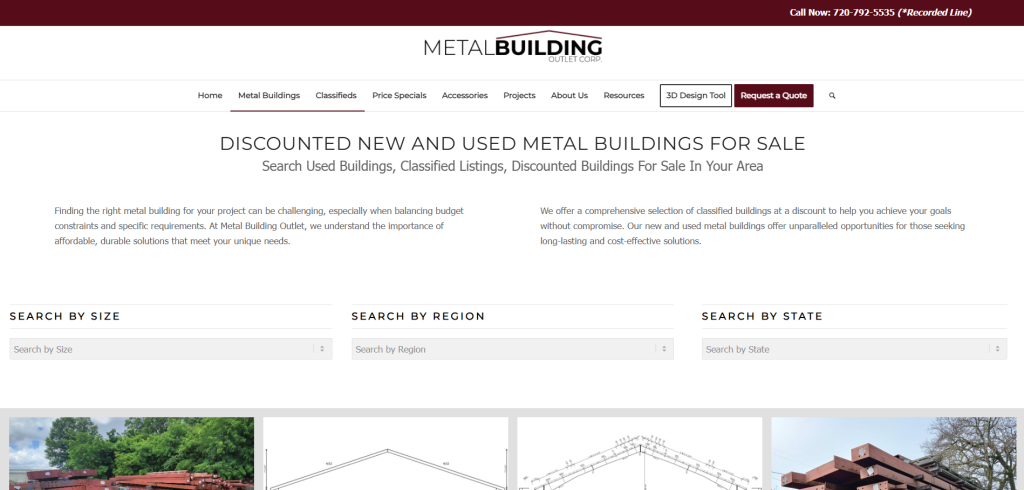
Achievement
Overall increase in conversion rate, conversions, and engagement metrics across all product pages due to the improvement of navigation to one category page. This A/B/C test saw over 16,000 views.
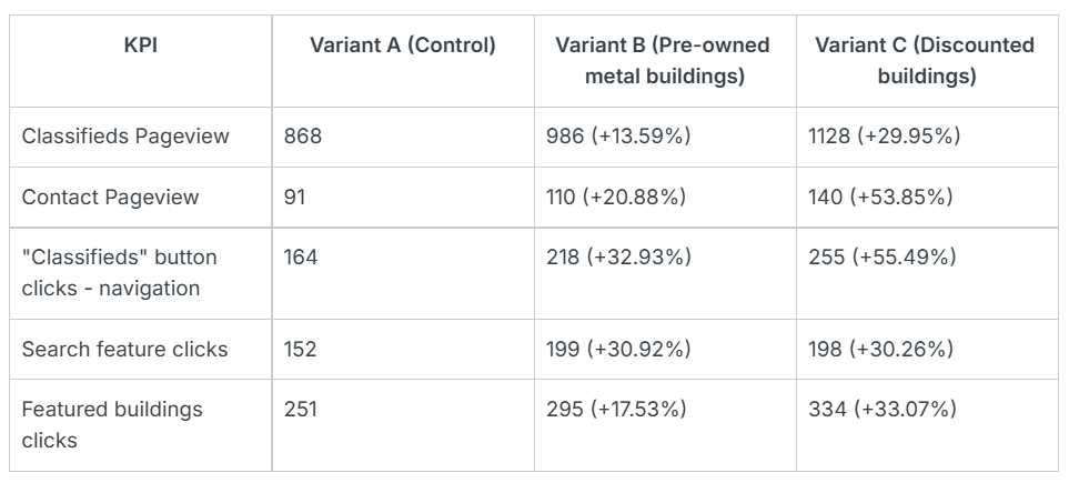
- Overall, the Variant C Discounted Buildings saw overall higher conversions and conversion rates across all KPIs:
-
29.95% increase in Classifieds Pageviews
-
53.85% increase in Contact Us Pageviews
-
55.49% increase in Classifieds Button Clicks
-
30.26% increase in Search Feature Clicks (On the Classifieds page)
-
33.07% increase in Featured Buildings Clicks (On the Classifieds page – if not using the Search Feature)
Based on these results, we can confidently say that the Discounted Buildings Variant is the winner.
Full breakdown of the KPIs measured
- In the 2 weeks of testing we saw a 40.24% lift in key events and a 67.73% lift in session key event rate (compared to the preceding period)
- Notably, with 431% lift in session key event rate on the /classifieds page alone