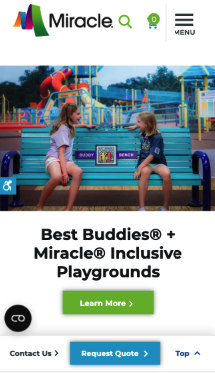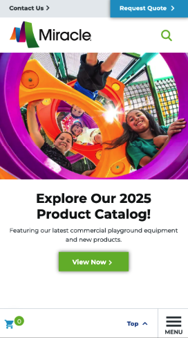
Current menu and button placements may not be optimized for user engagement, navigation efficiency, or conversion rates, potentially leading to usability challenges and lower interaction rates.
We conducted a 30-day A/B test to evaluate whether repositioning the hamburger menu and cart button to the top menu would enhance accessibility and navigation, making it easier for users to locate essential functions. Additionally, we tested whether making the contact and quote buttons sticky in the footer would improve visibility and accessibility, leading to higher engagement and an increase in quote submissions. We anticipated that these design changes would enhance the user experience and drive a measurable boost in conversion rates.
The variant received: