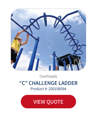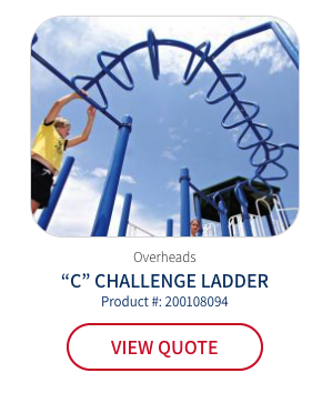
We aimed to see if a subtle change to the button color would increase its visibility and, in turn, encourage more users to interact with it—for example, by clicking to view their quote page and ultimately converting.
We conducted an a/b test to compare user engagement and conversions between the original red “View Quote” button and a clear-colored version after a key user action, to determine which color resulted in more clicks and conversions.
The A/B test on the “View Quote” button color change (from red to a clear color) on category pages achieved the following:
=>Showing that even minor changes can drive results.